Adapt to create
beautiful at home boxes
THE PROJECT
Creatively help business adapt to at home boxes and refresh their website.
LOCATION
Liverpool
DATE
2020 (the year everything went tits up)
THE BRIEF
- Oversee the end-to-end creative development for their new At Home Delivery boxes
- Create a new website design that better reflects their brand
THE APPROACH
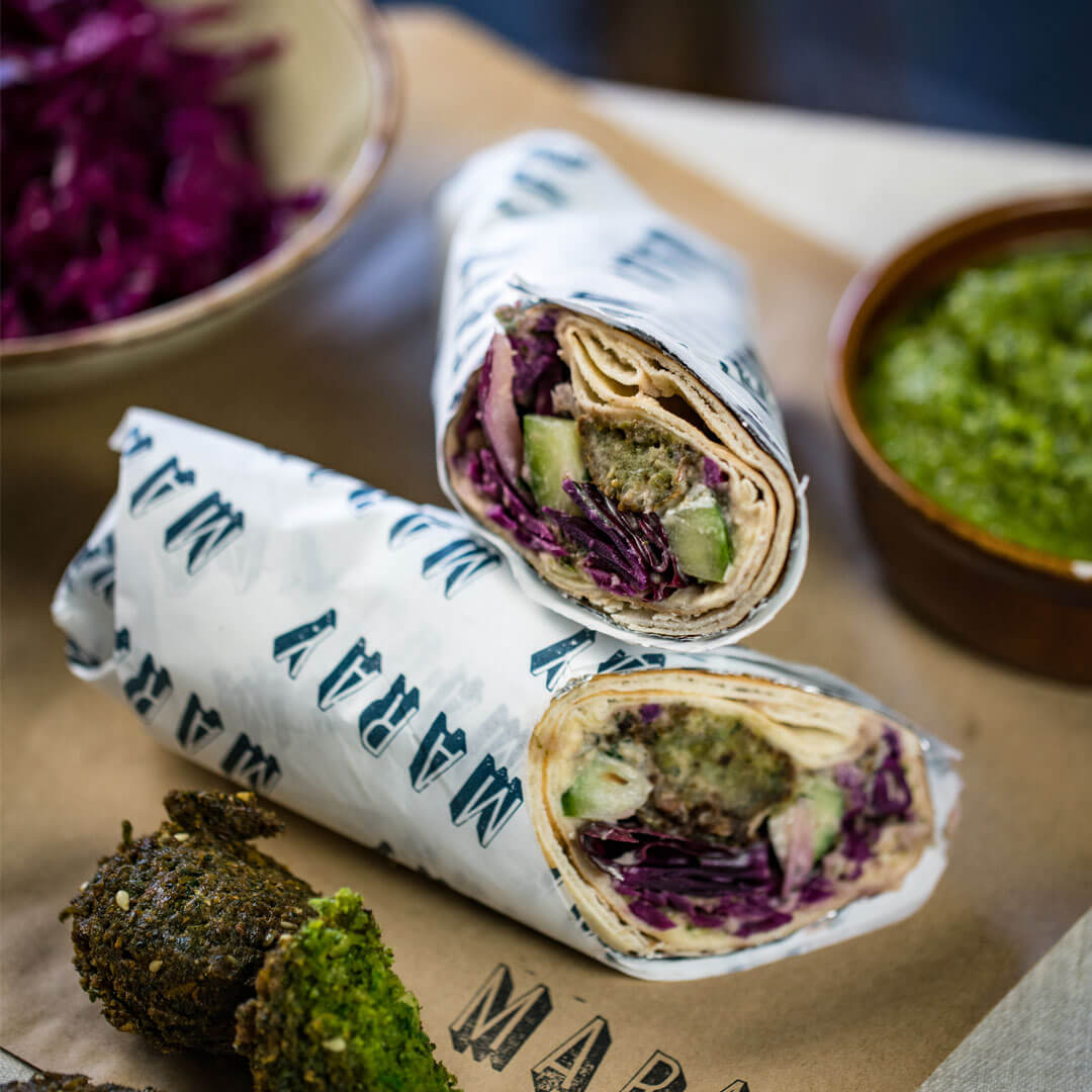
Maray is a business that is going places – and fast! It’s a thoroughbred Middle Eastern restaurant that’s cut its teeth in Liverpool and are expanding across the North. They have a truly distinctive look, feel and offer, and were gunning for big things before the pandemic hit. We’ve helped them with their visual identity previously and we were passionate about putting together a unique creative for their at-home delivery box that did their food justice – not an easy task. It needed to be sharp, fiery and balanced. As well as capturing the brand essence in delivery form.
WEB REFRESH
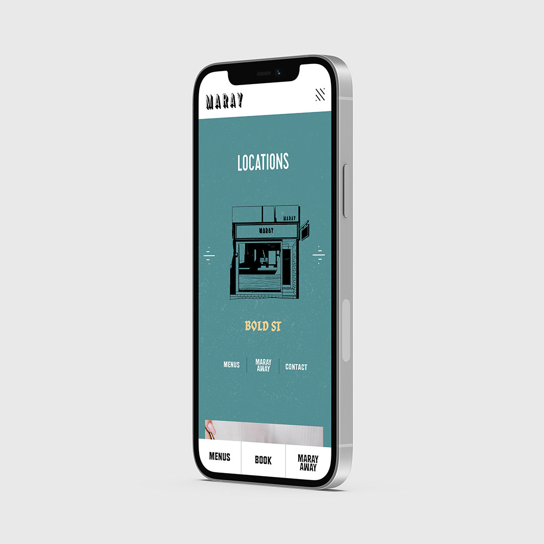
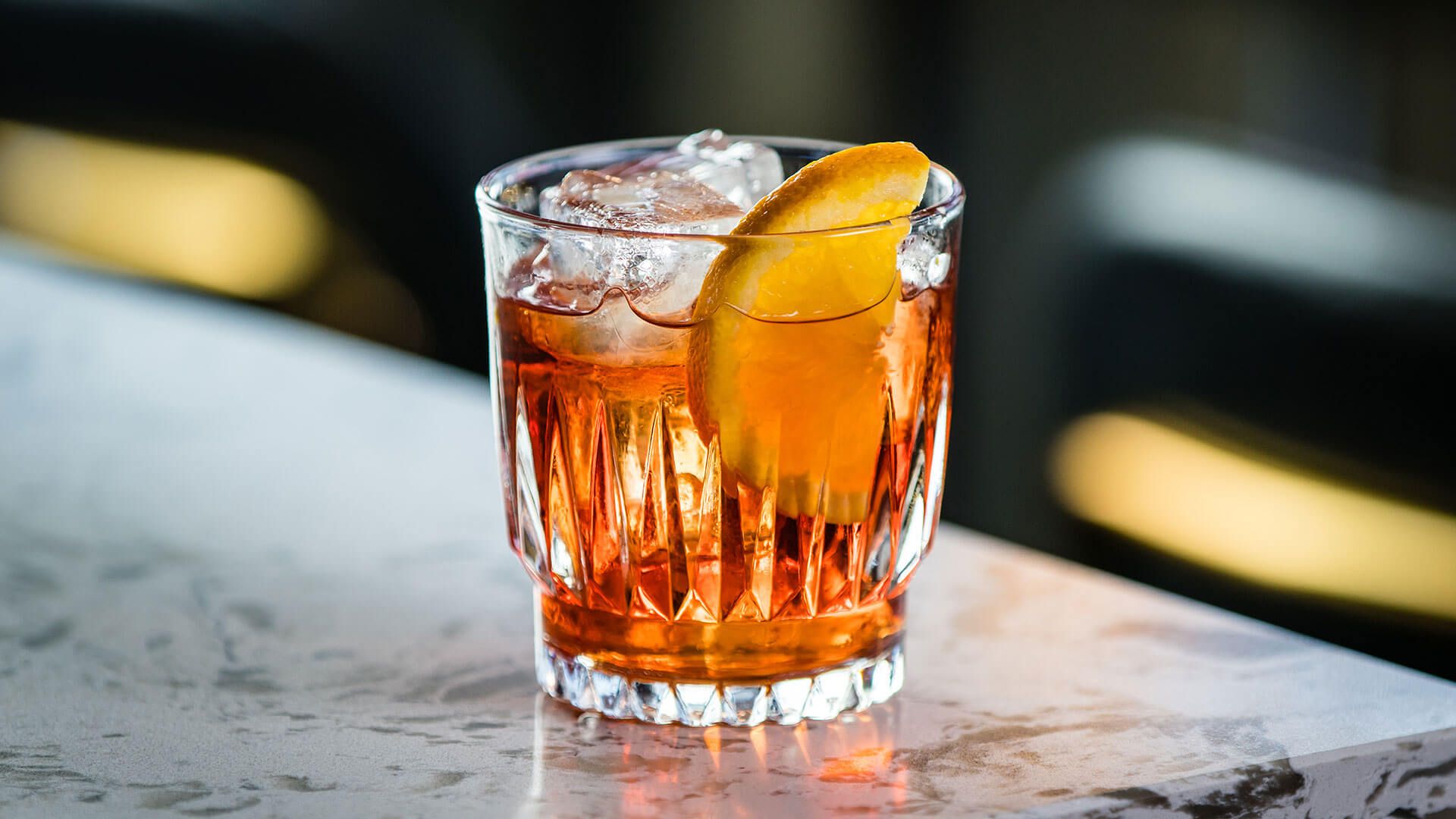
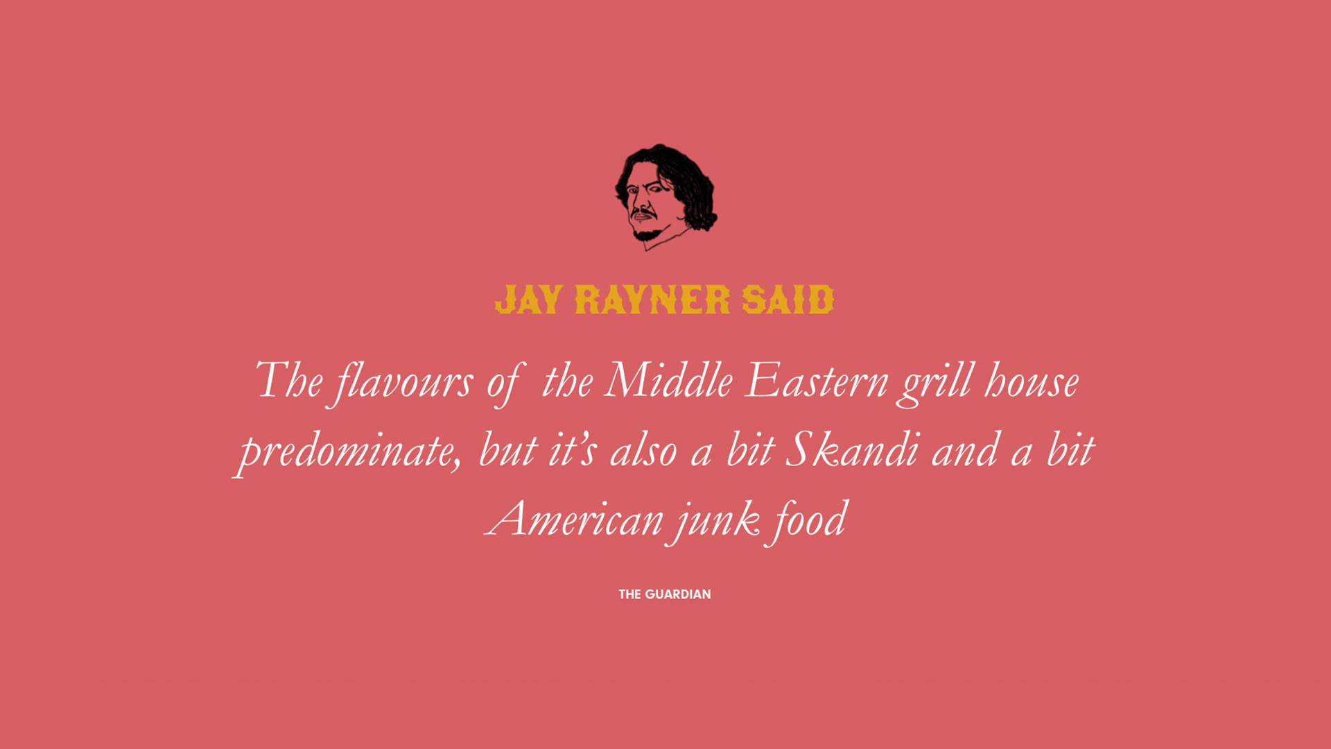
We also undertook a full overhaul of the business’ website, driving the UX and creating a streamlined look and feel that better reflected the in-site and at-home experience. Simple, clean excellence was the key driver behind the website concept. We didn’t want to overload with information, but get across the key messages of the business, alongside crucial functional information about where the sites are situated, what the menus are, and how you can book. To drive engagement, we adopted a multi-media approach, combining a banner video, conveying the warmth of hospitality at the site, cut with enticing high-res shots of their tantalising food and drink menu; alongside simple graphic illustrations for each site, with a call-to-action buttons for booking and menu details; before sprinkling a bit of background information on their story; and following up with a serious slice of recommendation from The Guardian’s Jay Rayner. Easy to navigate and enticing on phone, tablet or laptop.

Sick designs. Made up with the end result.
Tom White, Director, Maray
THE OUTPUT
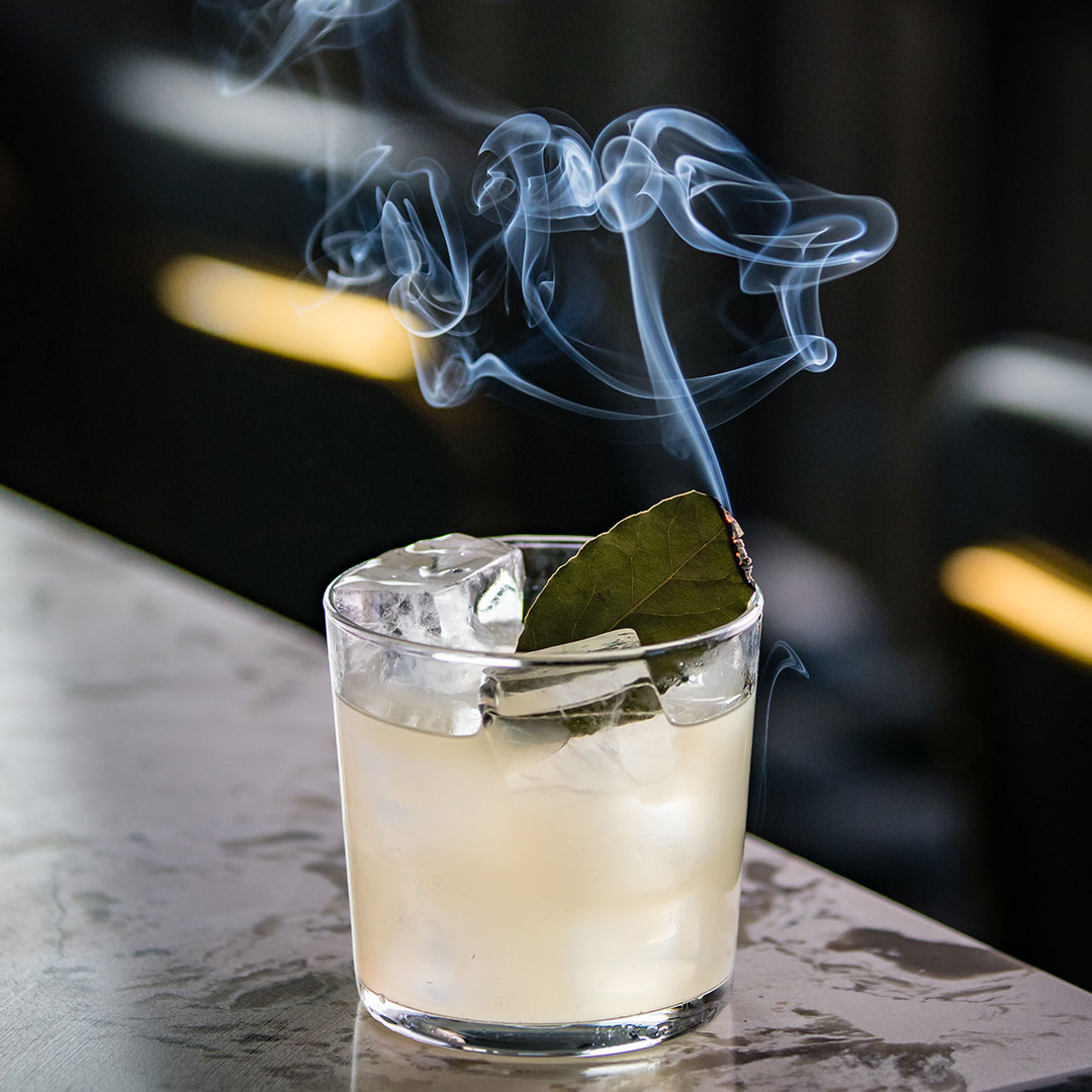
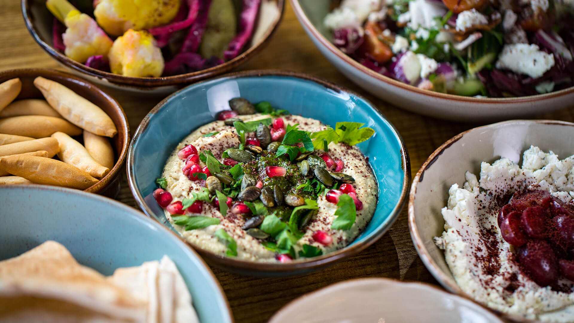
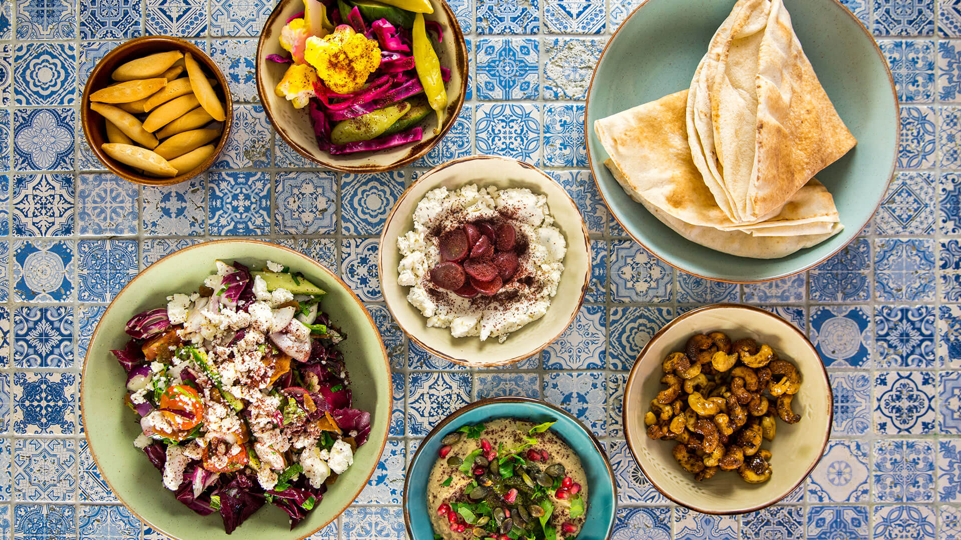
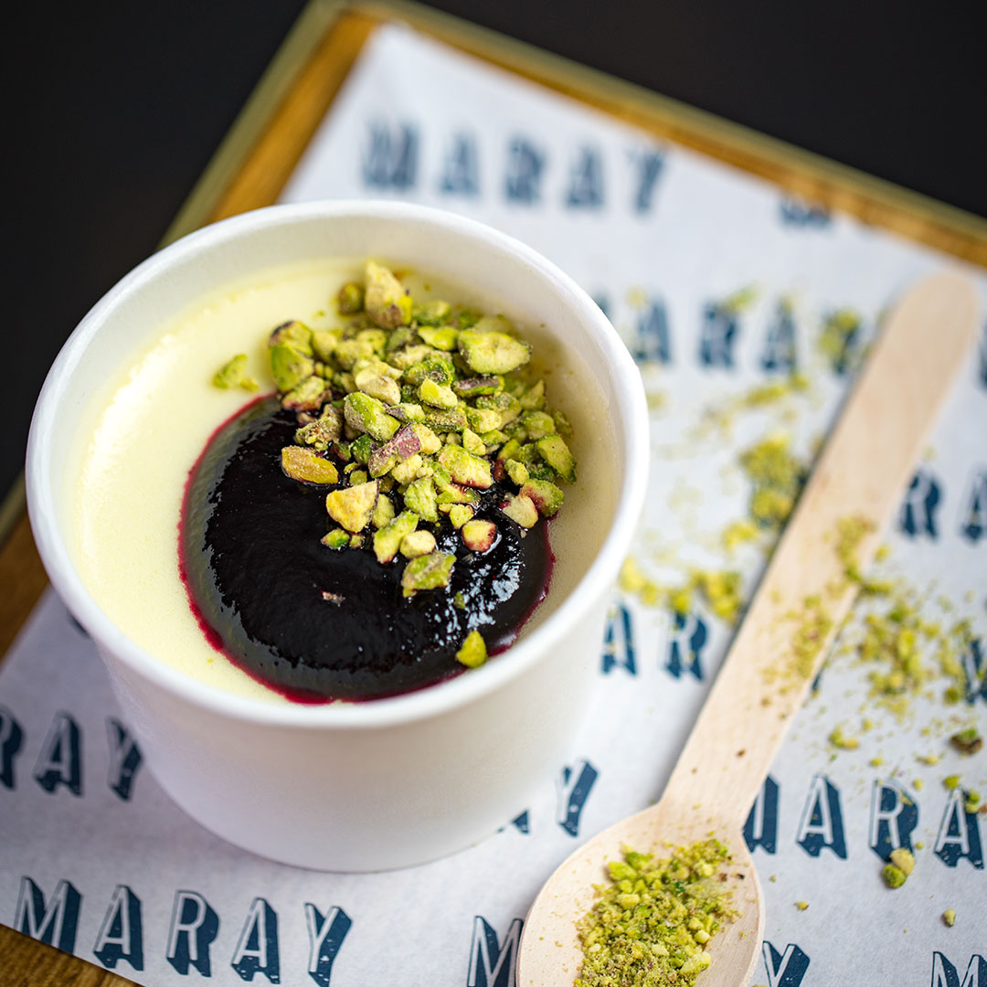
- Photographed x20 dishes
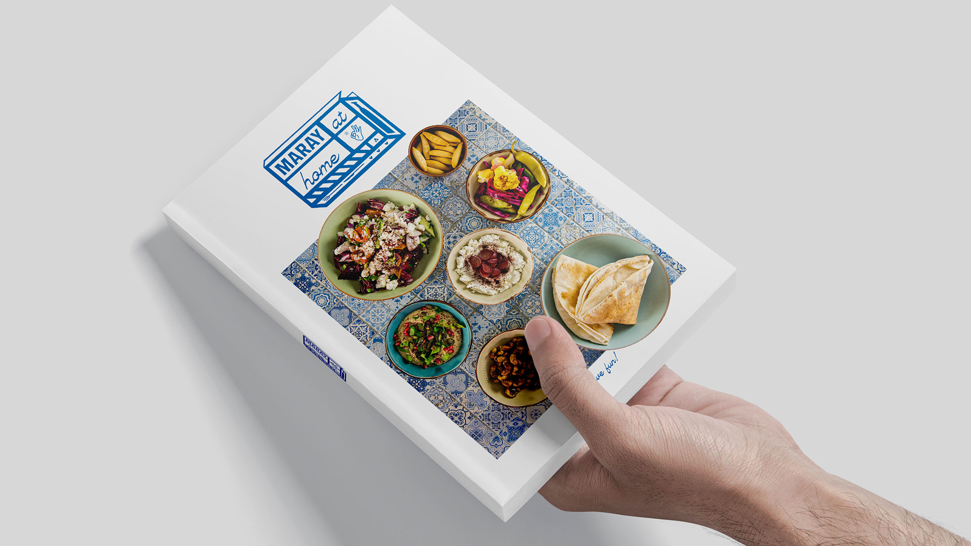
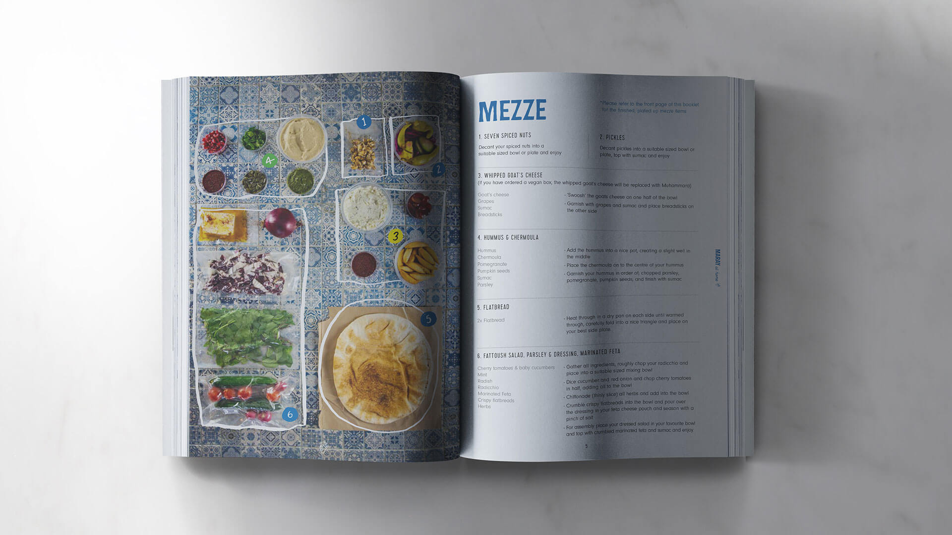
- Designed a slick informative, clear and cool AF brochure
- Chose a suitably tactile and sustainable paper stock and managed the print run
- Consolidated the newly created sub-brand with a style in photography / design / font / look & feel
- Fully creative photoshoot
- Streamlined website complete with its very own illustrated Jay Rayner!
THE RESULTS
- The box sold out weekly and has helped the business grow and thrive in lockdown. It even featured on This Mornings best home meal kits.
- Website refresh has directly increased table bookings, and bums on seats.
BEHIND THE SCENES
We have so much respect for the team at Maray, so to be asked to help them circumnavigate the nightmare of the lockdowns and launch a proper kick ass campaign to promote their Maray at Home boxes was great.
We took photos, filmed a promo and designed a beautifully tactile brochure to accompany the offering – a full 360* campaign all with a real tight turn around time. Happy client. Happy and well fed NSD team!

``Maray have got it right - total hospitality in their heart. They are probably our most creative client and it's a real pleasure to support them with their growth an adaptation.``

The Black Friar
Branding, Design, Photography, Videography