Understated luxury in the heart of Chester
THE PROJECT
X By Harry Guy
LOCATION
Chester, UK
DATE
September 2021
THE BRIEF
Creating branding concept for X by Harry Guy. Designing logo, logo mark, typeface and creating all mockups. Team and food filming and photography.
TITLE NEEDED
Like many city centres, Chester is currently undergoing a massive period of change, particularly on the hospitality front with so many interesting venues popping up all over the high street.
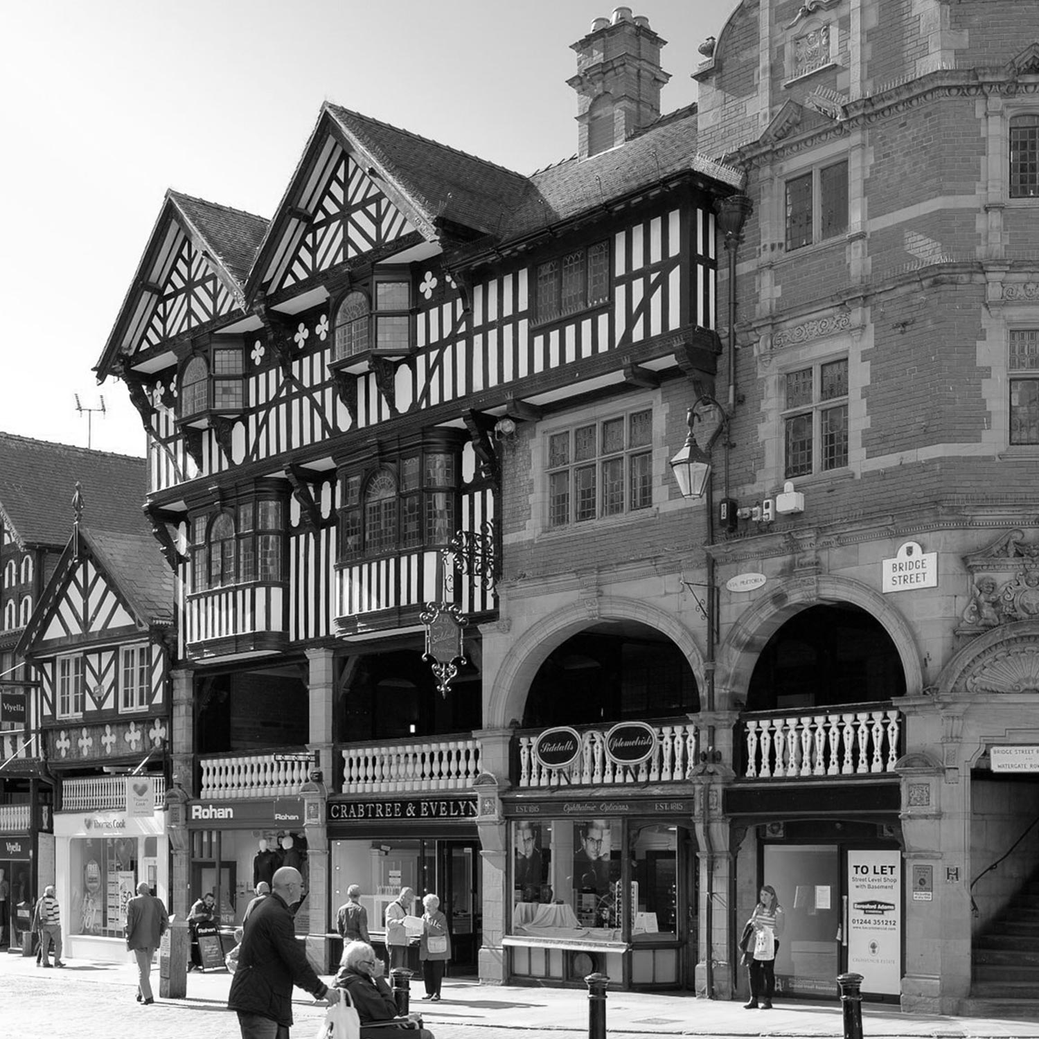
One such venue is the brand new Wildes Hotel, which will sit at the confluence of Chester’s famous Buttercross and Watergate Street. The scaffolding is up and building work is underway to regenerate this historical corner of the city into an 18-bedroom boutique hotel with a spectacular and eponymous restaurant ‘X by Harry Guy,’ set to open in late 2022.
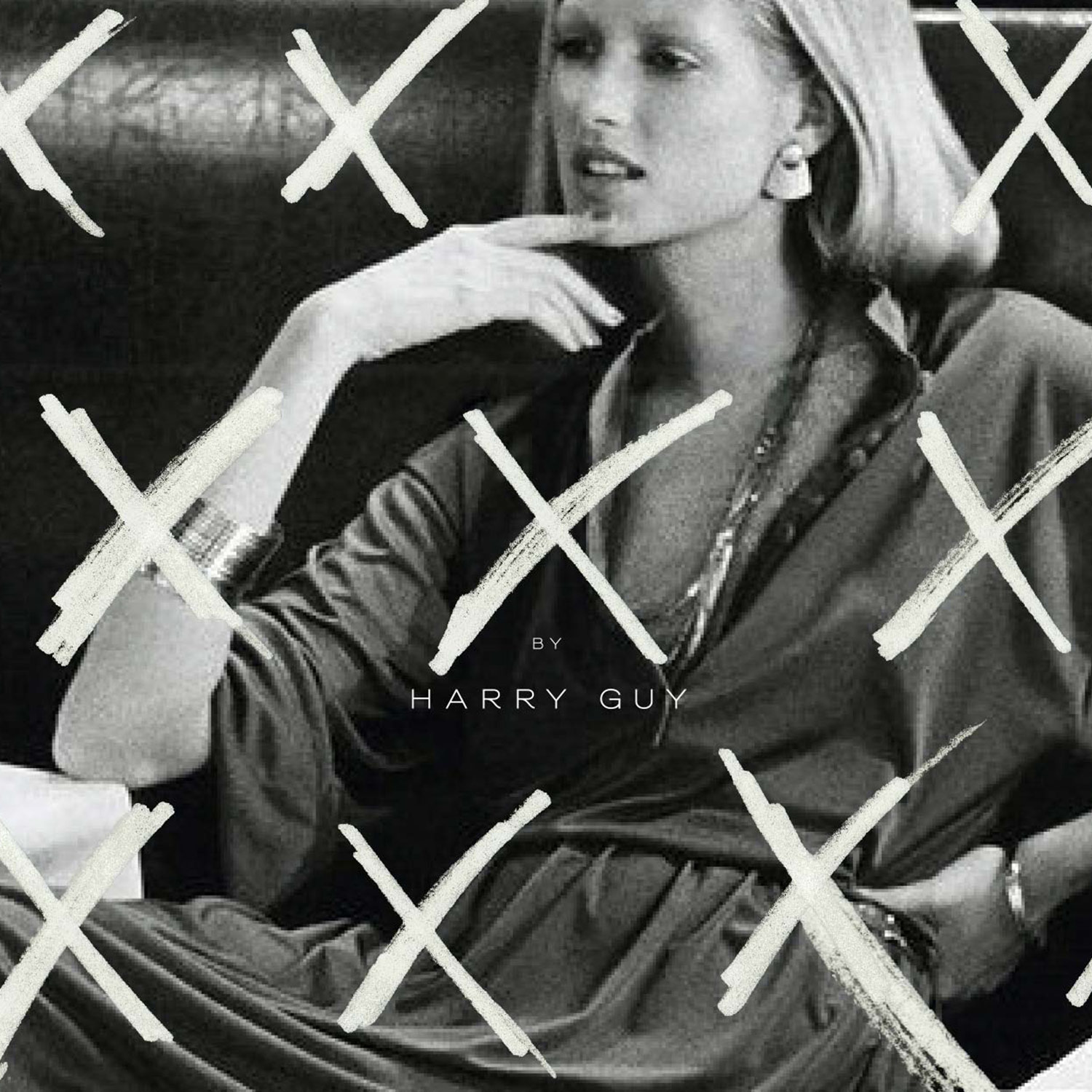
We were approached to create a full creative branding concept for the flagship restaurant including designing their logo, typeface, font and colour palette. We knew that we would need to come up with something really quite special and completely unique for Chester and befitting of a venue that is set to become one of the finest restaurants in the country.

TITLE NEEDED
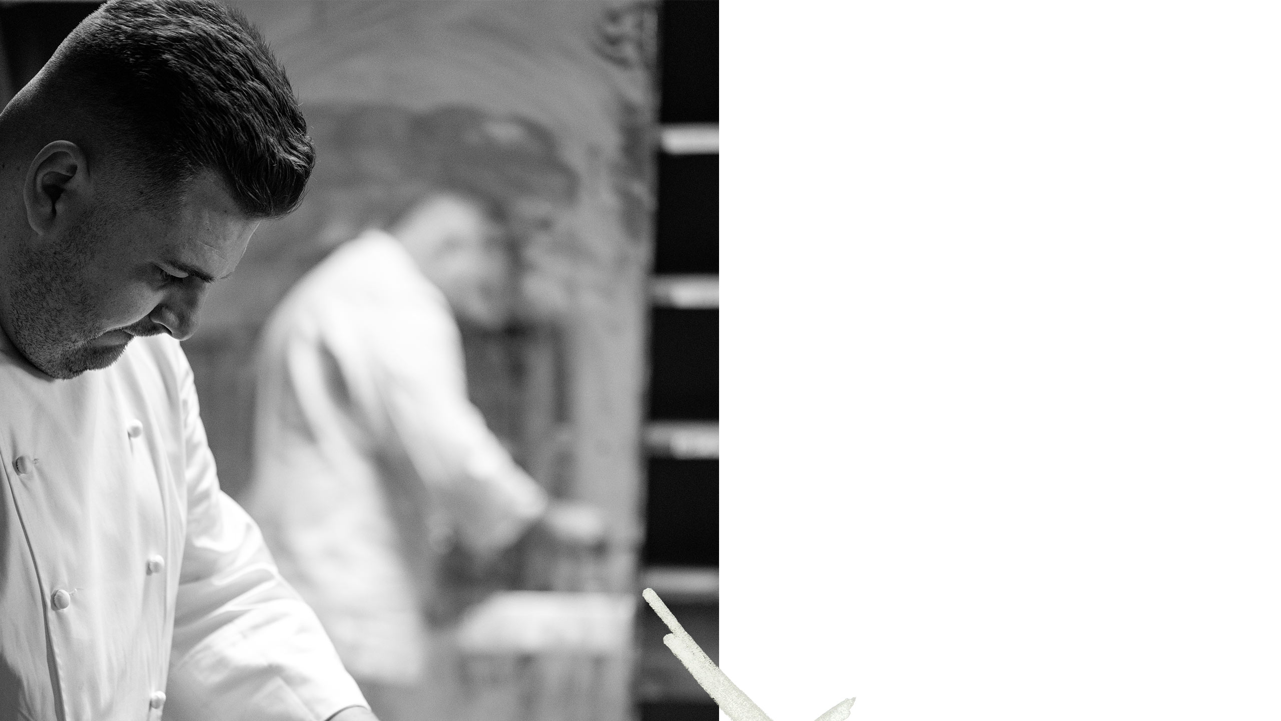
‘X’ will be Harry’s first solo venture but he is more than ready. Despite his humble nature, his CV is unbelievable and he has worked in some of the best restaurants in the world (L’enclume, Roganic, Aulis, Gordon Ramsay’s Savoy Grill, to name a few) As well winning the prestigious Roux Scholarship in 2016, Harry has described opening X, as the ultimate career goal and ‘something that dreams are made of.’ We knew the pressure was on for us to nail it but luckily we hit it off with Chef Harry right away so the creative process was really enjoyable and easy.
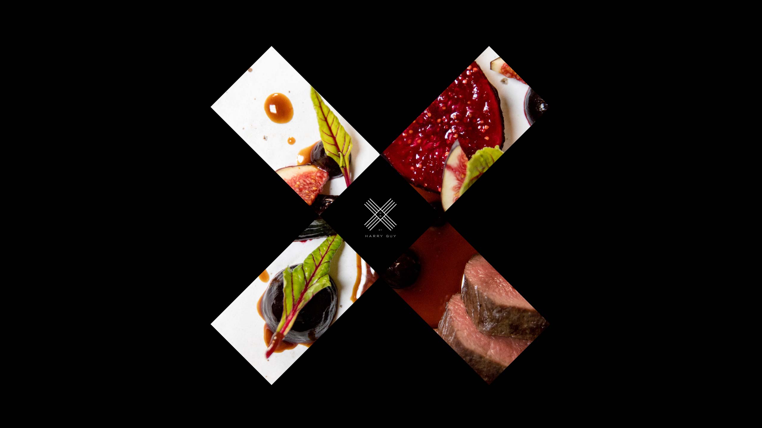

I absolutely love it. It’s classy, sophisticated, minimal and elegant.
Harry Guy
THE RESULTS
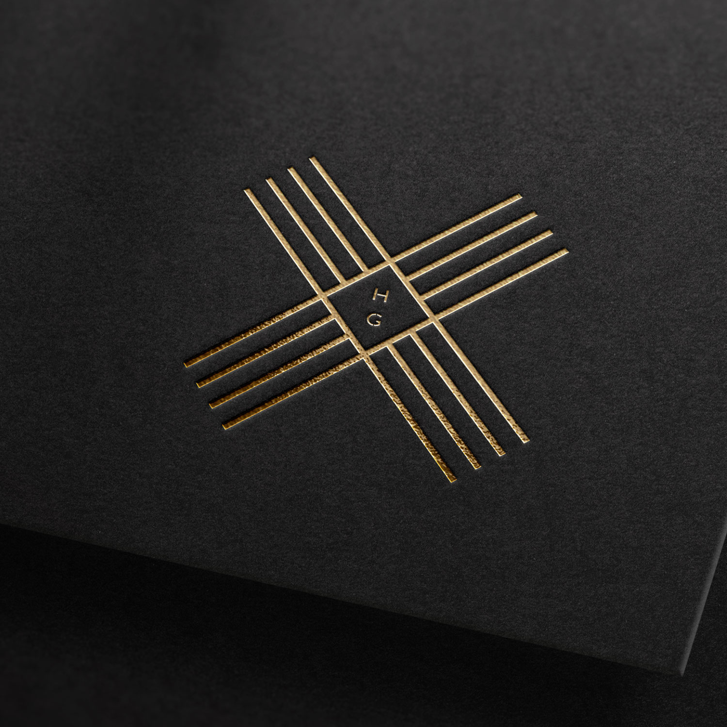
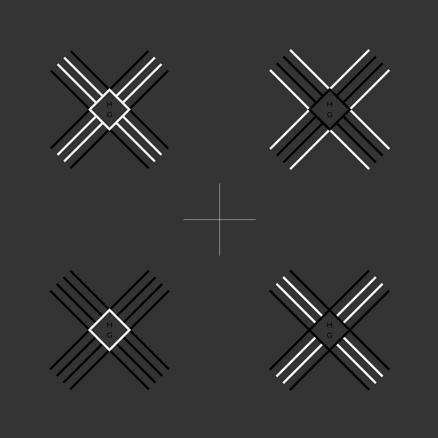
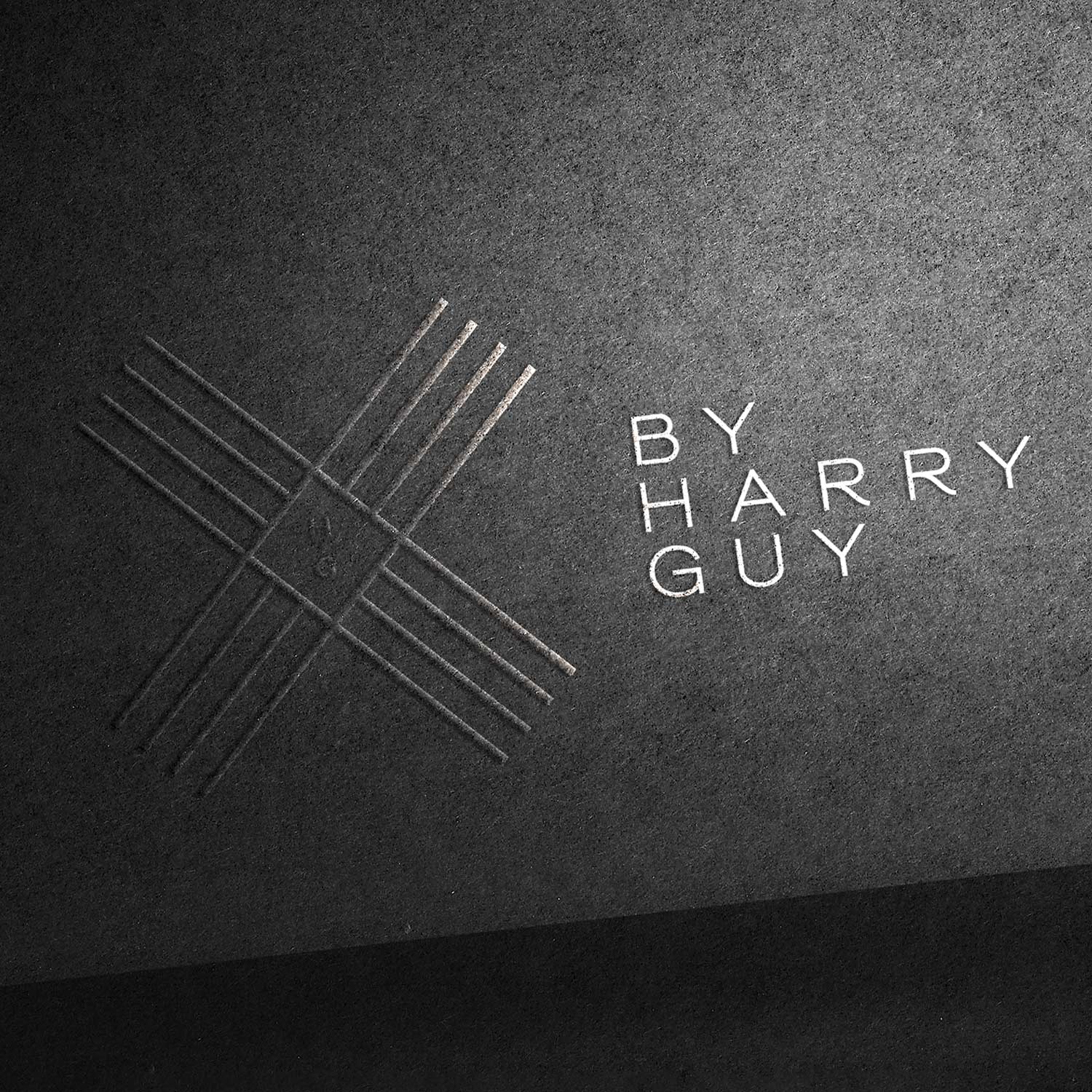
We also conceptualised the Wildes Hotel branding of which X by Harry Guy will sit among. As with any sub-brand, it needs to nest within an overarching head brand, yet be strong enough to stand on its own. We referenced the linear aspect of the Wildes logo and used that as our key and then played around with the symbols of X. Is it a cross? Is it a letter X? Is it a check mark? In truth, it’s all of these; the building itself is at the literal crossroads of the city, the restaurant address is number 10 and with Chester being an old Roman outpost, we liked the idea of making a subtle reference to the roman numeral for ten being ‘x’ and then also the idea of x marks the spot. Harry’s initials feature at the heart of the logo just as he will feature at the heart of the kitchen.
THE RESULTS
We created a brand colour palette which Harry wanted and described as ‘invitingly dark and atmospheric’ that has a real sense of understated luxury. This was received so well, it is being incorporated into the interior design strategy. We love a bit of design synergy.
FILMING & PHOTOGRAPHY
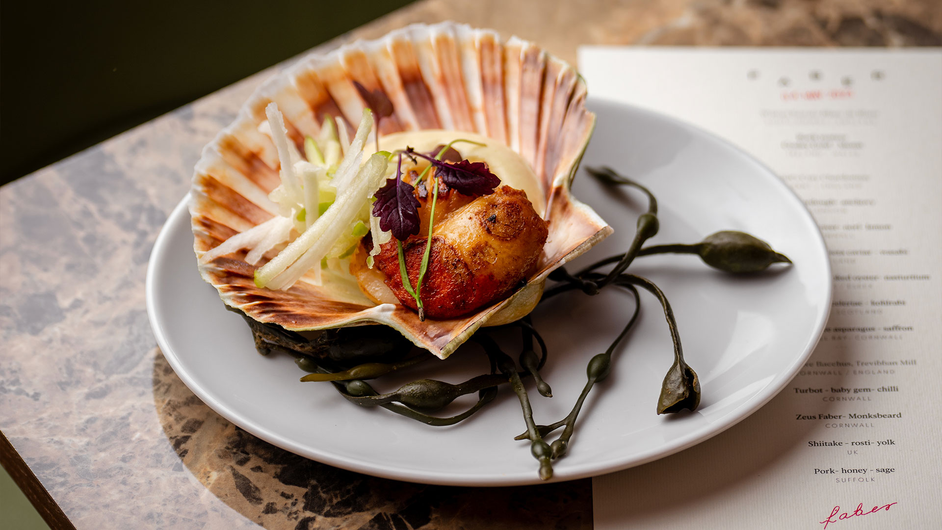
The purpose of the shoot was to get some social media content and imagery to get people talking.
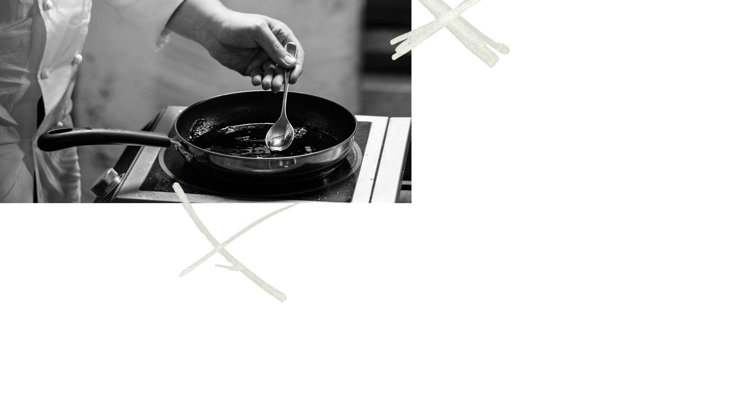
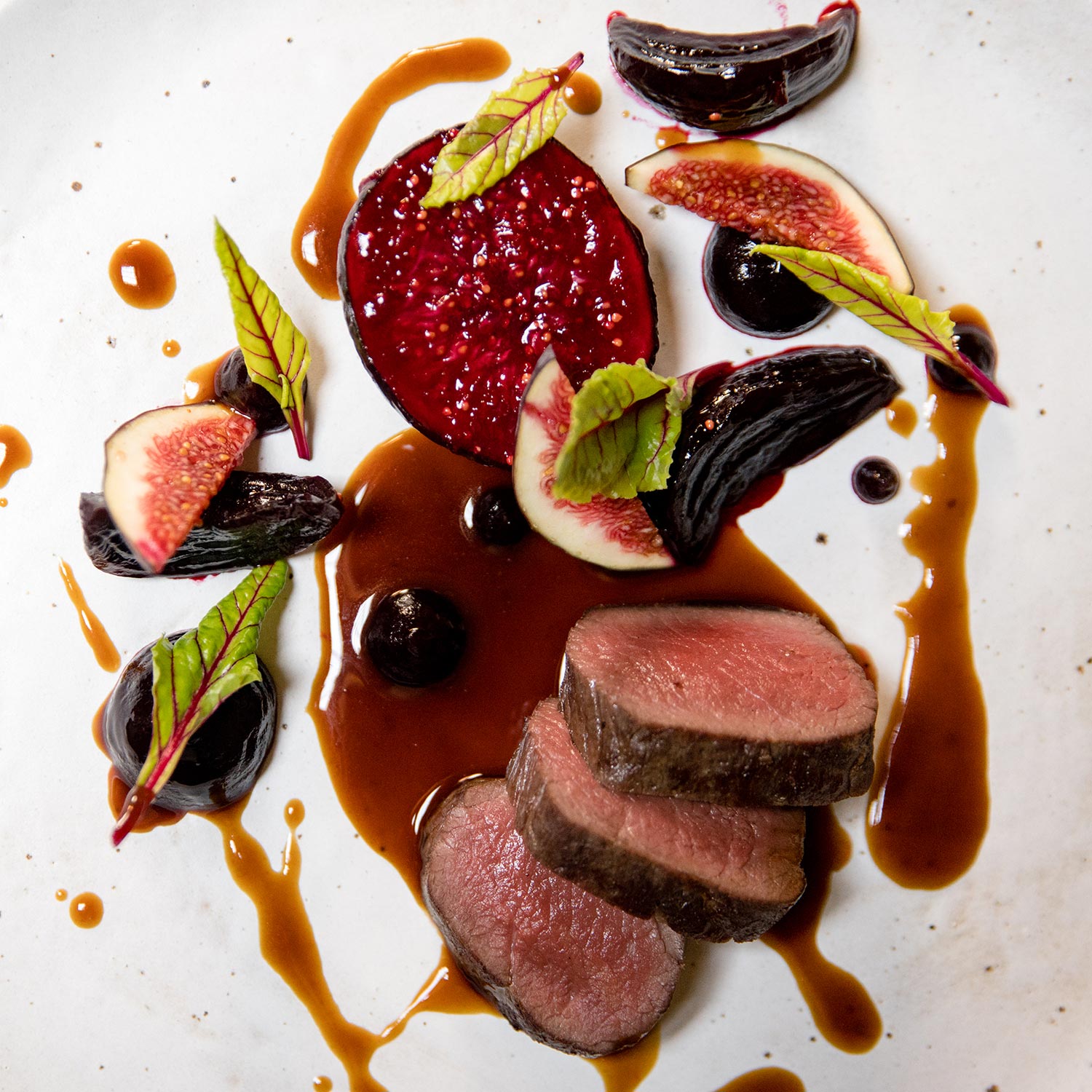
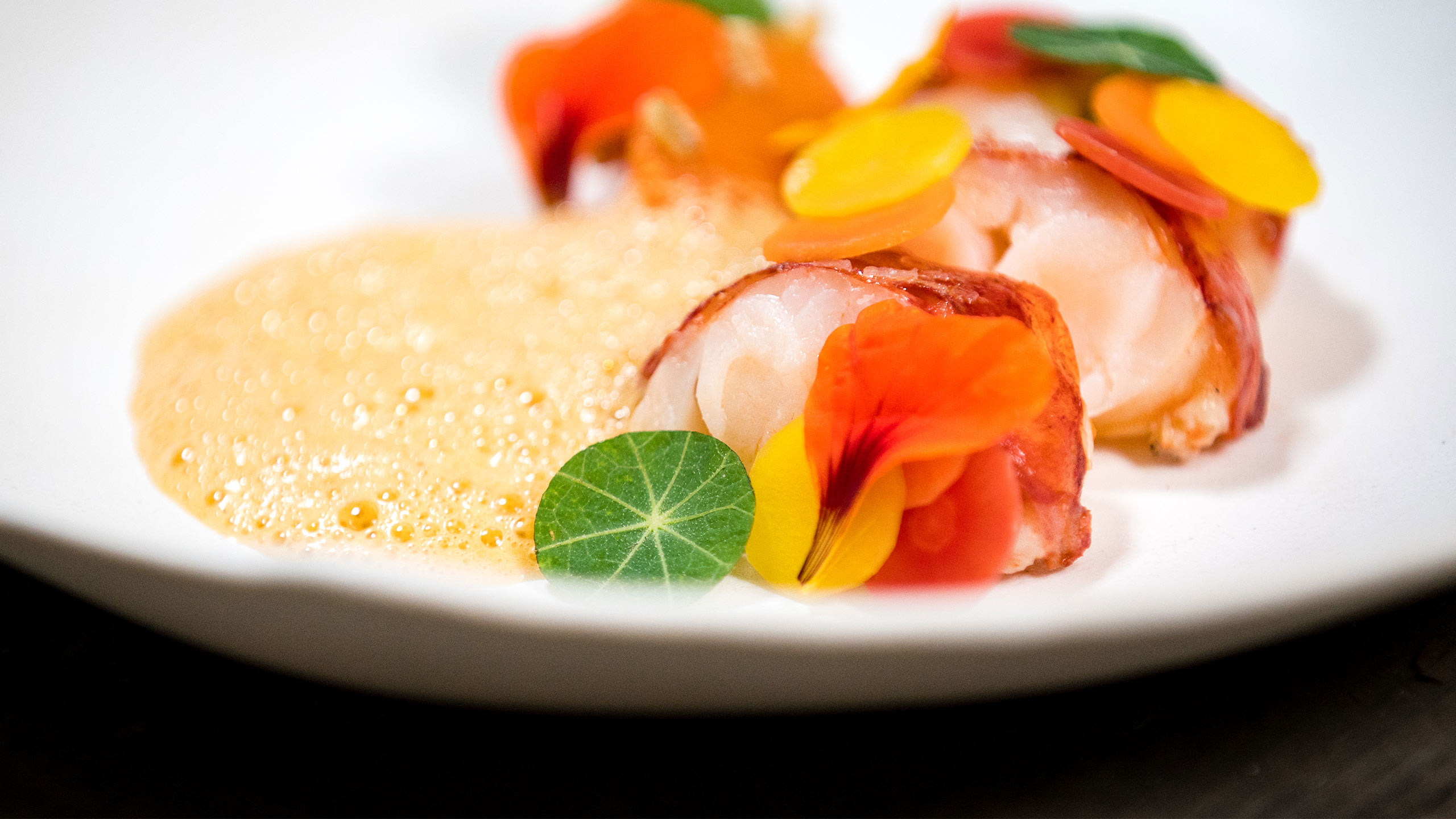
We spent a day in mid July ‘21 filming and capturing still images onsite amongst rubble and dust of this decrepit 1960s room with graffiti and plaster falling off the walls. Harry was extremely resourceful and knocked it out of the park by preparing some absolutely stunning food on a single induction hob and a fold away table.
“All in all, it was fantastic to see this whole massive project start to come to life. Chester deserves a development of this scale and ambition. This has been years in the making and we’re super stoked to be part of this awesome team.”
Dan Burns, Director

The Black Friar
Branding, Design, Photography, Videography